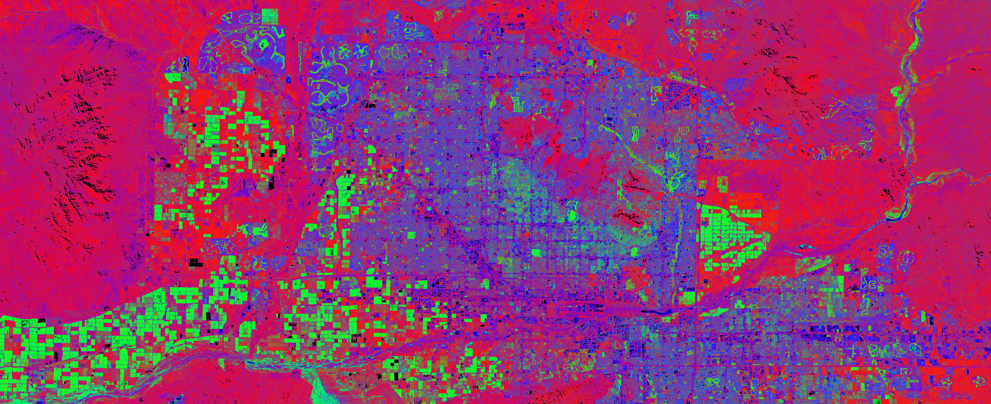
Oh it’s a heat map. I get it.
I was just reading an article on the neuroscience of creativity in the Atlantic and came upon an image comparison of two brains.
The two brains were gray, with green, yellow or red splotches of color where synapses were firing most. Or at least, I think that was it. You see, a normal, non-neuroscientist human being simply doesn’t have the tools to parse heat maps of brains.
The problem is, we think we do. We are used to heat maps: the more intense a color is, the more we attach the concept of intensity to that area, whatever the intensity is supposed to mean in the occasion. On a poverty map, the red zones are usually the poorest. On meteorological representations, red is hot and blue is cold. Intensity can show population, crime rates, racial disparities, or any other type of data that we are able to parse because the legend is simple enough for us to understand.
What neural maps do, on the other hand, is give us a sense of familiarity (after all, we know very well how to interpret a heat map!) with a completely, utterly alien concept.
There are as many neurons in a human brain as there are stars in the Milky Way. Red for intense… what? Firing of synapses? But I don’t have a clue what that means. I don’t usually even know the baseline: if one brain has more red splotches than another, am I looking at a difference between a catatonic vegetable and a Nobel prize winner, or two persons who slightly differ on their love for cheese?
Mozzarella beats Roquefort.
This made me think about the danger we’re all running of becoming overly familiar with visual representations, and assigning meaning to utterly confounding concepts, and how this is easily used against us when there’s a need to convey complex data and the authors wish for readers to accept something without critical thinking.
Just throw it in a heat map.

.jpg)